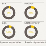
I rather like this graph from energy provider Good Energy, which shows the renewable/traditional mix for a handful of their UK competitors. It turns out that this data has been made publicly available in the UK since 2005, some of which has been documented on this public-interest site. That site looks at the mix per […]